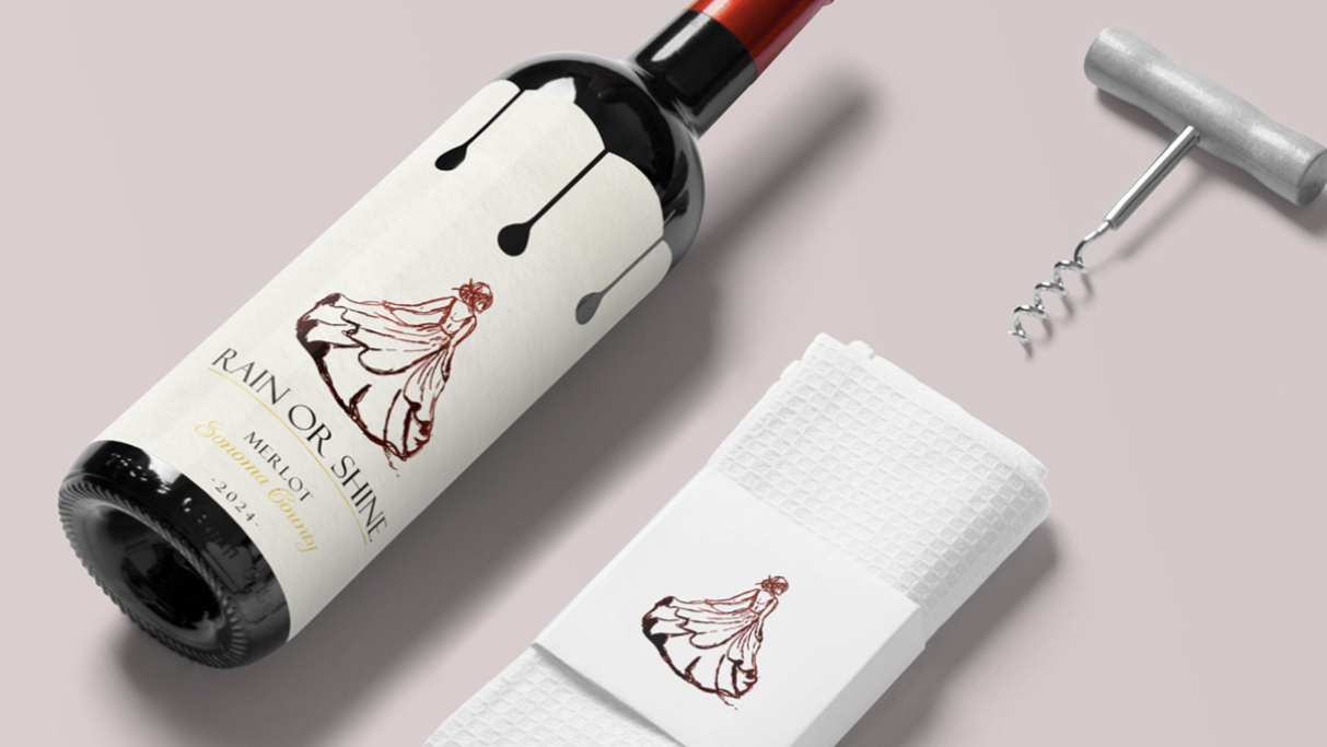
INDUSTRY: Beverage and Coffee
WHAT I DID: Packaging Design, Logo Redesign
CONCEPT:
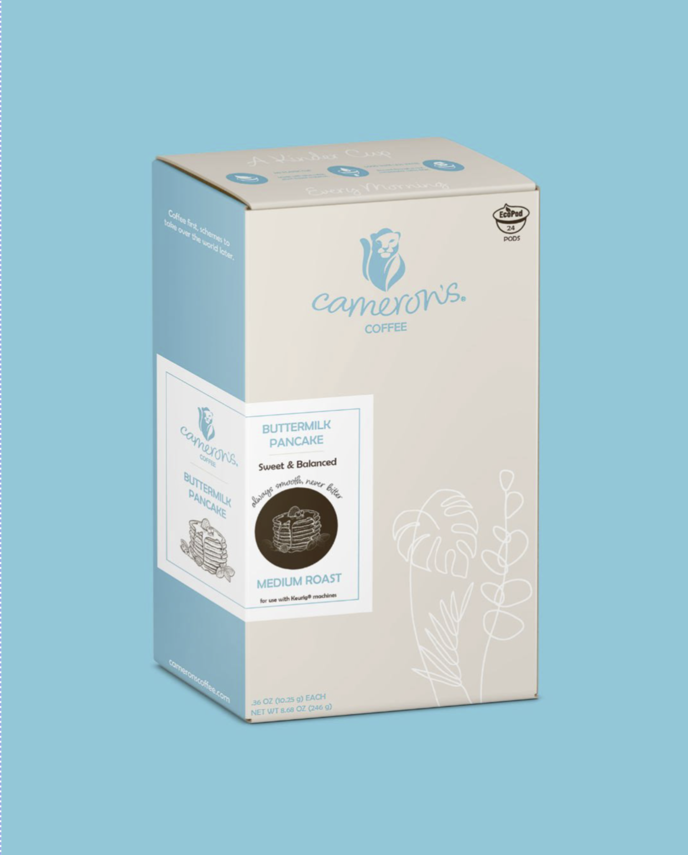
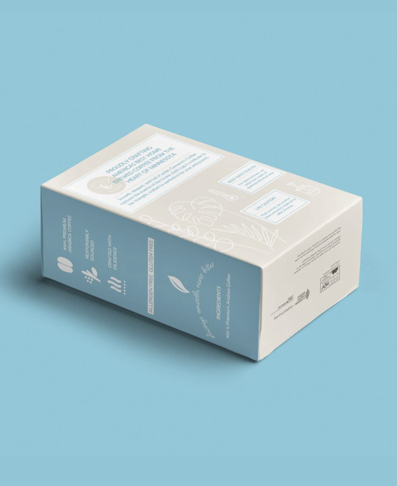
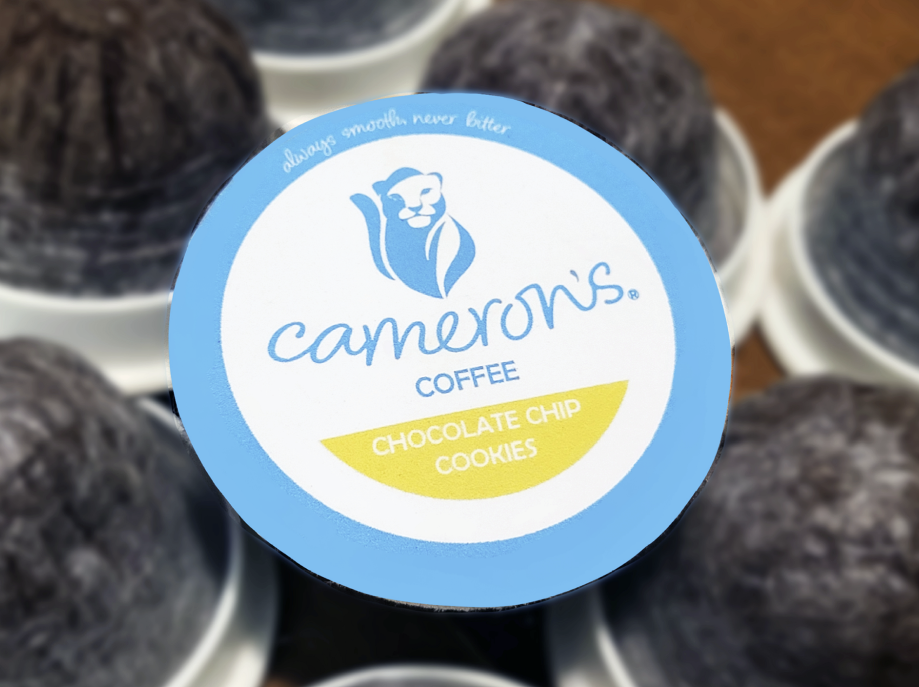
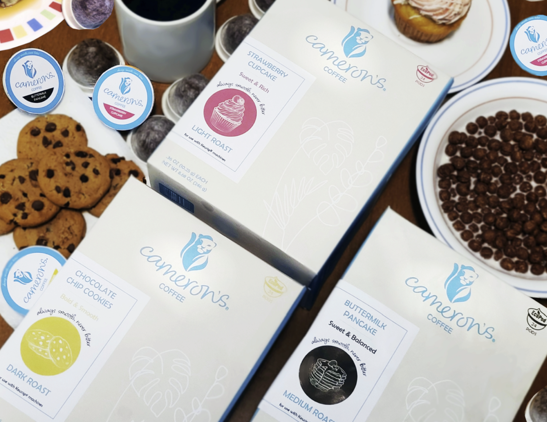
As a coffee lover, I came across Cameron’s Coffee in the store and felt disconnected from the brand. While their product is high quality, the current modern, minimal look felt too cold for the coffee space, which is an industry where warmth, richness, and storytelling matter. Through this redesign, I wanted to bring personality and charm back into their visual identity.
Cameron’s once had a more expressive look, even featuring a lion in their logo! This was a nod to their bold character and history. My redesign focuses on reviving that original spirit with updated packaging and a refreshed logo that emphasize sustainability, coziness, quality, and approachability. The goal: to better reflect what the coffee actually delivers.